Explore and describe how meaning is created in media products through the interaction of diffrent elements
Meaning: Colour, language, Text; Music; Images; Sound effects; Performers; Costumes; Props used in Audio-Visual
At the opening scence it shows previosly what happened , this allows the viewer to get an idea of the action that happened in the previous episode, compared to soaps they have "gossip" and on-going storylines which lets the viewer catch up of any information / strotylines that they might of missed.
The costumes denotes that they are students are in school uniform this connotes that its based around a school. Scruffy uniform connote a bad behaved student and even a poor wealthy lifestyle, as an open shirts connotes rebellious of students, audience we make judgements based on the characters lifestyle, behaviour, class, education, gender etc. The teachers are wearing suits which identify there status within the school.
In the begging scences there are lots of shot cuts from one charcter to another. Then it cuts to the theme tune of the programmes and shows the main chracters invloved .
The text used in Waterloo Road is that it shows the text 'previous' then showing clips from the previous episodes. Also the titles shown of Waterloo road shows that the word of the programmes 'Waterloo Road' is spelt out in school tables with people in the titles showing the scenery and connoting its about education. Also connoting a morden and contemporary time period. The titles of the production elements such as who the episode have been created by, written by the producer etc. which is in a simple font of 'Ariel' in the colour white which is easy to read and to identify the elements of production. The language used identifies the status of the characters by the way in which they speak, furthermore the head teacher has a posher tone and is well spoken which identifies her role/ job title within the school in comparison to the other teachers. The pupils are spoken in a 'common' accent which identifies the establishments of where it has been set which is in Rochdale, Manchester. Some of them have a regional accent representing their regional identity. The casual linage again shows there rebellious behaviour. There is a lot of music transitions used within this episode, this clip uses various genres from:
pop/ rock 0:53-1:07
pop/rock 6:07- 6:44
alternative rock 9:15- 9:52
hip-hop 12:45-13:55
The music within the episode expresses the emotion and the storyline in the episode. The music also connects with the demographic who watches the show which are teenagers/ adolescent/ younger adults . Other mise-en- scene elements such as Set decoration/ design is used such as the scenes have graffiti on the school lockers and on the walls which connotes that the school is notorous for being on the scraphead with poorly behaved students and a poor quality of teachers which creates a negative representation for the school in the programme. Other set decoration consites of typical things you would expect to see in a school such as class room layouts, whiteboards. The proxemics within the scene are mainly objects close together which fills the space and makes it more like a school scenary. The location of the programme was previously set in Manchster which reflects the behaviour and the lifestyles of the characters.
The props used within the episode reflect the storyline such as the drugs that are used within the episode which demonstrate drug issues in the use of young teenagers. The prop of the drugs are consilled in a small paper pouch which shows the secretary and the location of the relevance which is done in a toilet. Other props include typical school objects such as bags, books, classroom activity such as cooking approns etc. theses props are used to make it more realistic to the audience. The performance of the characters bring different kinds of elements to the programme such as the students and the storylines may give the audience a sense of involvement to relate to the storylines. The teachers can bring a sense of humour in which there character is portrayed, which is light heartening to the storylines
Hair and makeup is used to reflect the characters personality and there status e.g. someone who has more scruffier hair and not a lot of make-up may be considered a 'geekier' character in comparison to someone who looks like they look after themselves better, more tidy hair and make-up. The appearance of the characters also reflect what type of character role they play e.g. if they have their uniform smart and immaculate they are portraying a 'nerdy', 'intelligent' character and if the character has more scruffy uniform they maybe portraying a more rebellious character or isn't interest in education.


Colour text, language, imagery in print

The colours used on this newspaper are red, blue, grey, light shade of yellow and white.
The rose red colour could represent our country and the british flag also the colour red could represent and show love and passion of our country. The colour light blue could symbolize pride and peace and could furthermore represent the british flag .
The light shade of yellow could connote ‘hope’ and happiness .
The text is bold and the white writing stands out and takes up most of the page . The word "hope" is in bigger written which stands out . The article on the left hand side is smaller compared to the picture, which shows that the picture of David Cameron has a larger status and wants to stand out and appeal to the people viewing the paper .
The image of David Cameron has a proud feeling and shows a religious iconography to our country which reflects the words "hope" and who we look up to as "our only" . This image is a iconic artistry by Shepard Fairey who has use the same technique with other celebrities such as Obama, The Joker from batman, sports players, hip hop artists etc. This has been concidered a efficacious type of illistration as a political aspect. Furthermore by this imagery this will create creater awareness as this has been portrayed before with other similar area of fields.
The language of the sun appeals to a mainstream audience , it tries to attract all different kind of people by the stories , and the mixture of news such as sports - which will appeal to a more male audience , celebrities and gossip - which may attract a more female audience . However from this front cover and the language this suggest that it's aimed for a older demographic, due to that a older target audience may be into politics and our county compared to a younger demographic . The language on this paper is about a political aspect however the text is written simple which makes the audience who may not be knowledgeable about politics understand. The text is trying to persuade you to vote for the conservatives by a written rhetorical question 'do you want five more years of exhasuted Gordon Brown ? if not you should vote for the conservatives' . This front cover is a way of advertising to the consumers to vote for cameron rather than Brown and is using techniques to try and win votes. By using the words 'Today the sun has says its time to trust David Cameron' suggest that if the sun back up David Cameron in a positive way and back him then this could effect other peoples decision on voting. This could argue that they are not representing the other political parties in a fair and positive way the language used about Gordon Brown. The language used in this paper uses a simplicity sentence structure which enables the demographic to read easily and understand. The register between formal and non-formal text is used within this article which is more casual than a broadsheet, furthermore the language has been composed towards a mainstream audience which makes it accessible to the readers who not educational to a political aspect of knowledge. This motives and appeals to a massive/ more popular demographic.
http://www.guardian.co.uk/media/organgrinder/2010/may/06/the-sun-david-cameron-front-page
In comparison to the Guardian which uses language that appeals to a much more intellectual audience with a more understand of a political aspect, where as in comparison to The Sun which used simple language to appeal to a broaden readership. The Guardian will appeal to a niche target audience in compression to the sun due the language that has been publicly used. The article comments on the the Sun's article which could be considered as a controversy between the rival papers. The Guardian comments on 'Todays sun's front page stands out amount it's rivals but not necessarily for the right reasons'. Which suggest crictical response for the paper. The paper also comments about The Sun's imagery and saids 'It is not as imaginative as 2005's Sun election stunt, when the paper mimicked the selection of a new Pope by turning the smoke from the Wapping chimney red to show its support for Labour. And it lacks the savage wit of the paper's 1992 splash when it told readers: "If Neil Kinnock wins today will the last person to leave Britain turn out the lights." This suggest that the Guardian are reminiscing about The Suns past and criticising their publsihing habbits/ articles that they have published.
Broadsheet example

The colours represented in this paper has a much more sophisticated, intellectual feel with the colour of purple, black and white. These colours also show a formal format of the paper in comparison to the front page of The Sun which uses more primary colours of red, blue, yellow. The colours being represented on The Daily Telegraph also reflect the target audience and show that the paper is a broadsheet with the use of colours. The blue tie that David Cameron is wearing could reflect/ symbolises his party of labour which is is representing.
The image shows David Cameron making a speech which works with the headline of Cameron on the money. The imagery stand out with a purple background with a lighter suit. The colours represented such as purple could reflect Cameron as an MP as intelligent/ wise and represents his wealth which is reflected through colour psychology. The image reflects the article that David Cameron is making a political campaign speech in order to stand by his political party of Labour.
The text/ language featuring on The Telegraph headline features play on words. "If you are on the money, you are right about something". And one of the main subjects of the debate was economic policy. The Star's editorial was elegant, articulate and right on the money. The language used on this paper is mainly political based with the use of information about Cameron and other MP's of Gordon Brown. The language on this paper reflects a much more intellectual demographic and consumers who are interested in politics. Comparing this paper to the Sun, the front page is mainly filled up with imagery where as this broadsheet example of The Daily Telegraph has text filling up the whole page boarding the image. The readership of this paper will have a niche audience compared to the sun, however this paper contains more text and goes into more detail. The language on this paper has more complex words which is aimed towards a more business, political educated demographic in comparison to the Sun.

From this screen shot i have highlighted language/ text that wouldn't be represented in a tabloid newspaper as this language is much more complex with use of intellectual language that people wouldn't understand in a tabloid paper.
Definitions of Connotation, Denotation, Signification, iconography, anchorage with examples
Denotation - what you can see , the obvious , literal
Connotation- The things that you can see makes you think about , associated representaional ideas.

The denotation of this poster would be , a male , with blue electricity from his hands and fire in the background , there is gold text ' i am number four' ' which stands out againsts the black background , he is wearing a jacket / hoodie .
The connotatiations could be it looks like an action film becuase of the fire and the blue electricity , which shows his powers and that he is the main character. The words ' i am number four ' could actively suggest he is a secret agent as the 4 could be a code name ; like 007 (James Bond) .
Ferdinand De Saussure - Introduced us to Sinication , Signs , Signifers & Signifieds . Signs link to Signifers & Sigifieds .
Signs can be words or images , it can be a act or gesture used to foward an idea , information or command .

These signs symbolize the different letters to make up a word , this is a gesture used for people who cant hear.
Signifiers is the form the signs takese.g. the hands which symbolizes the letters.
These signs symbolize the different letters to make up a word , this is a gesture used for people who cant hear.
Signifiers is the form the signs takese.g. the hands which symbolizes the letters.
Signifies is the mental concepts e.g. the letters that make up a word and the person responding .
Iconography - motive that has been used over & over again that we understand what it is e.g. coronation street begging opening there are packed houses , small , closed together and we think that Manchester is like this .


Anchorage - Anchorage is a word next to a picture / photograph to help us think & understand how something is ment to work / fixing the meaning . e.g. captions in photographs . This image of the Australian PM is an example of anchorage as this image explains the text and the text explains the image. The words needles is used as a pun in this photograph as she's knitting a kangaroo, and the imagery suggest she's a house wife which could show she doesn't know much about politics which has backfired. The words 'needles out for Gillard also suggest people are attacking her. Furthermore the image/ text goes with the picture and the picture works with the text.

Anchorage - Anchorage is a word next to a picture / photograph to help us think & understand how something is ment to work / fixing the meaning . e.g. captions in photographs . This image of the Australian PM is an example of anchorage as this image explains the text and the text explains the image. The words needles is used as a pun in this photograph as she's knitting a kangaroo, and the imagery suggest she's a house wife which could show she doesn't know much about politics which has backfired. The words 'needles out for Gillard also suggest people are attacking her. Furthermore the image/ text goes with the picture and the picture works with the text.

"signifies" (signifie): For Saussure , the"Signifers" was one part of the "sign". Saussure's "Signifids" is the mental concept ("signids") with a sound or image("signifer") . The relationship between the "signs" and "sigifier"is arbirary. Words or "signs" only have meaning as a part of a system (structure). The meaning of words or "signs" emerges out of differences that set them apart from other "signs" within overraching system/structure. Morden semiotics involves the study not only of what we refer to as "signs" in everyday speech, but of anything which 'stands' for something else. In a semiotic sense , "signs" take the form of words , images, sounds, gestures and objects. Contemporary semioticians study "signs" not in isolation but as part of semiotic "sign systems" (such as a medium or genre). They study how meanings are made ; as such , being concerned not only with communication but also with the construction and maintenace of reality. Semiotics and that branch of linguistics known as semantics have a common concern with the meaning of "signs", but where as semantics focuses on what words mean , semiotics is concerned with how "signs" mean.
Verisimilitude - True to life e.g. soaps use stroylines that we can relate to / that are true to life issues which gets the audience interested and feels involved within the soap .

Denotation - The denotation of this paper is that Barack Obama is looking in the distance, in the background there is a black and white images of someone with a camera which is blured, which could identify paparazzi. He is wearing a red tie, with a white shirt and a black jacket / a coat.
Connotation - The connotion of this front page of Obama makes me suggest that there is hope and that by his facial expression there is a sense of pride. The white shirt that he is waring could connote hope and the red tie could suggest passion and life which links in / connects with the words 'Reborn', which connotes that USA as a counrty is being brought back to life. This represents Obama in a positive way and that he can lead the country to success.
Signification - The mental concept of this front page is the text 'Reborn' which suggest the USA has been brought back to life, and that Obama has brought back the USA back as a country. Obama's ethnicity plays a big part of signification as Obama was the first African American president. Obamas status has been accepted due to the fact he was the first black american president. The words Reborn reflect that he has become in control and accepted in comparssion to previously eras where black Americans wasn't accepted.
Iconography - The iconography of Barack Obama is normally represented in a positive way looking proud and as a leader. The iconography that the mirror repeat is that they have the logo in the same place and stands out against the background colours which is normally white and black. The Mirror newspaper use the same font throughout the front page of the paper. They use either black or white text as there headline which stands out and grabs the audiences attention. Barack Obama has become a symbol of the potential of the black american to throw off his or hers buckles from the high ceiling.
Anchorage - The text that saids Barack Obama 44th president, 'Reborn in the USA' identifies the story even though there isn't further information. We suggest as a audience that there is hope this time for USA. The text anchors /gives meaning from the serious look of the president who gives 'leader of the free world'.

In this screen shot this is an example of anchorage as this text explains the picture and the picture explains the imagery. The pictures fix the meaning of the text.

Connotation, Denotation, Signification, Iconography, Anchorage in Print
Denotation - The denotation of this paper is that Barack Obama is looking in the distance, in the background there is a black and white images of someone with a camera which is blured, which could identify paparazzi. He is wearing a red tie, with a white shirt and a black jacket / a coat.
Connotation - The connotion of this front page of Obama makes me suggest that there is hope and that by his facial expression there is a sense of pride. The white shirt that he is waring could connote hope and the red tie could suggest passion and life which links in / connects with the words 'Reborn', which connotes that USA as a counrty is being brought back to life. This represents Obama in a positive way and that he can lead the country to success.
Signification - The mental concept of this front page is the text 'Reborn' which suggest the USA has been brought back to life, and that Obama has brought back the USA back as a country. Obama's ethnicity plays a big part of signification as Obama was the first African American president. Obamas status has been accepted due to the fact he was the first black american president. The words Reborn reflect that he has become in control and accepted in comparssion to previously eras where black Americans wasn't accepted.
Iconography - The iconography of Barack Obama is normally represented in a positive way looking proud and as a leader. The iconography that the mirror repeat is that they have the logo in the same place and stands out against the background colours which is normally white and black. The Mirror newspaper use the same font throughout the front page of the paper. They use either black or white text as there headline which stands out and grabs the audiences attention. Barack Obama has become a symbol of the potential of the black american to throw off his or hers buckles from the high ceiling.
Anchorage - The text that saids Barack Obama 44th president, 'Reborn in the USA' identifies the story even though there isn't further information. We suggest as a audience that there is hope this time for USA. The text anchors /gives meaning from the serious look of the president who gives 'leader of the free world'.

In this screen shot this is an example of anchorage as this text explains the picture and the picture explains the imagery. The pictures fix the meaning of the text.

This image is an example of anchorage in a newspaper. The headline fixes the text and explains what is happening in the image as he is praying against all the odds he will be found innocent . Also the imagery explains the text and shows why the action is taken place.
Connotation, Denotation, Signification, Iconography, Anchorage in Soap
http://www.youtube.com/watch?v=zUf79aj2n3Q


From this screen shot this connotes a gang culture by the police car in the background this connotes crime, the hoodies worn by the characters and the estate suggest a run down area. The dark colours worn by the gang suggests that they are bad, rebellious characters. This denotation of this screenshot shows the building of an estate, police car, boys in hoodies, grass areas.
The significations of this is that the colour black reflects a symbolic meaning of danger, bad behaviour etc. Hoodies have been associate with the media with anti-social behaviour throughout the early part of the 21 century repeated photographs in the visual media of a male youth with his hood pulled up over his head have been used to anchor text focusing on anti social behaviour and this had led to the signification of this garment have been used for a youth stereotype. Representation of this stereotype had led to the hoodie being a icon of this anti social behaviour and as a consequence all use wearing hoodies becoming an iconographic image for anti social behaviour and youth violence and aggresion , this has been grouped by successive media texted into a collective identity strongly linked to criminal behaviour.

From this screen shot this shows that the signification symbolises violence from the make-up of blood, which suggest he has been attacked/ involved in violent behaviour.
The iconography represented in the shots show a negative representation on youth culture and violence in gangs.

This image of eastenders is an example of Anchorage. With this image the text of 'Eastenders' explains that it is set in the East end with the image of the river and the map which helps further explain the image. Also the image is doing the same thing of the map and the river with the text explaining that this is part of the East end.
Techniques examples of cropping, sizing, Choice of camera angles
Cropping

This tool is called cropping , where you select only the part of the images you wanted to keep , this can improve the framing of an image. Cropping may be performed on a physical photograph, artwork or film footage, or achieved digitally using image editing software. The term is common to the film, broadcasting, photographic,graphic design and printing industries.
In the printing, graphic design and photography industries, cropping refers to removing unwanted areas from a photographic or illustrated image.
http://en.wikipedia.org/wiki/Cropping_(image)
Cropping in Audio visual
http://www.youtube.com/watch?v=PMQDHSbs-_o

This link above shows a artitexture of a clock face building which has been cropped so we can see more detail of the tower / clock face in a iMovie software programme. The cropping has made the image thinner with a bigger image size.
Framing
http://www.youtube.com/watch?v=SkAHOYITYk8

This link above is an example for framing which is demonstrating on the software of iMovie, this is a step by step video which has been used to represent certain imagery in scene. This video has done this by layering two images together showing different angles of the release of the club being swung back and forth in order to show the golf shot.
sizing :
sizing is when you can vary the size of an image for example :

This tool bar can be found on google which allows you to search an image in any size you wish.
Sizing in Audio- visual
http://www.youtube.com/watch?v=SSrX3dqVYjE
This link above demonstrates sizing and how to make an image bigger in the software iPhoto. This has been done to improve the quality of the image and make it more visible for the person viewing the image in a appropriate format of sizing.
Choice of camera angles :

This photograph is an example of a 'medium close-up' shot which is used to show emotion or the characters reaction , this could add drama ,or comedy to a scene and to create a certain atmosphere. In this photograph you can see that the man's expression doesn't look happy. The shot of a close up is from the

Medium shot :
is from the waist up , medium shots are also used to show emotion and body language of a certain character or characters . In this photograph spiderman body language shows that he is being stangled by the dark evil spider man . The black clothing symbolizes his evilness .

Long shot :
is used to establish the scene and created a atmosphere , it is normally used in the intro or the begging scene of a film . This also shows the scene and the characters . Also a long shot is to show the mise-en-scene e.g. the surroundings / location , all the charcters bodies from head to toe and their costumes , lighting , props etc. In this photograph it shows the chatcetrs and the location to make an impact on the audince which creates a certain atmosphere and evokes emotion to the audience through the different scenes.

Birds eye view shot :
This shot isn't used very that much but may be used in action films , when they are on a building looking down. This shot makes the bellow objects and the people look small . This shot could also be used for a charcter looking down at another character to make them look more 'stronger' or 'bigger'.
worms eye view shot :

worms eye view shot is someone looking up , this is the opposite to birds eye view. This shot isn't very used that much but most seen it action films. This shot can also make a charceter seem small or to come across as intemidating to a 'bigger' character .
Extreme close-up :

Extreme close up is used for focusing on detail , it is used sometimes in horror films when focusing on an object that is going to be important for example a weapon which could symbolize the death of a murderer in a horror movie.
http://www.youtube.com/watch?v=g1-sImGslRw
This link above is an example for camera angles used in audio- visual, this link is from Eastenders .
use of camera angles in print


This camera angle has been used to enthises a rock look with an low angle shot with an artistic shot from a broadsheet newspaper, which shows the artistic elements from a low angle side view shot. This shot shows a sinister element from the dark lighting which has been represented, the shot has almost given Liam Gallagher a reptilian, bird like view from the low side angle, which shows him looking down at the audience.
Use of stars in Audio- Visual :
Eastenders have used stars such as the character 'Eddie Moon' who is played by David Essex - David Albert cook . Who is a english musician , singer-songwriter and actor, has been shown in the soap Eastenders. Tv show and soaps use famous people to try and keep there ratings up and for people to watch the show and be interested in the celebrity and there role within a television show. Also the use of celebrities bring there followings to shows current ratings which increase the viewers for the show. Barbra Windsor is another example for use of star in Eastenders as she has been in the soap for a long period of time which keeps the viewings at a high peak.


From the use of star this has proven that the ratings of soaps has risen and beaten there Tv soap rivals and a beaten record of 9.3 million viewers.
Fonts in Audio- Visual

The font used is to appeal to a younger audience , this text is placed on a urban background with eastenders in bold dark letters , the reason being eastenders is in bold letters and not E20 is because eastenders appeals to mass audience and a multi-national -(well known) , which identifies that this show is a spin- off from eastenders. E20 may be in red text to blend in with the background and because E2O isn't that well known because it has a specific target audience aimed at teenagers. The block logo behind the font attracts young demographic and makes the font appealing to the correct demographic.


This is an example of a medium shot, this has been used to focus on the character and show the dialog going from one character to another.

This is an example of a wide/ long shot, this has been used to identify the scenery of the setting and to show the characters who are involved. This shot has also been used as the camera zooms in and focuses on the follwoing characters who are in the scene.

This is an example of a medium close-up shot, this has been used to show the characters expression, which will have an impact in the following scences. This shot has also been used to show that he is the main focus in the shot as this has been a cutaway from the scene above.
The font that has been represented for Eastenders in aimed towards a older demographic in comparison to E20. The colouring and the imagery also reflect this will an older map with the colours of green and blue. The font remains in the same font as E20 but with a different colouring which creates a different feel which attracts a different demographic age range.
Use of Camera angles in Audio- Visual

This is an example of a close-up shot used in Eastenders, this shot is used to explain the storyline that a snake has gone missing which will cause an issue later on in the show. As this shot has been established us as viewers know the problem by the focus on the tank.

This is an example of a medium shot, this has been used to focus on the character and show the dialog going from one character to another.

This is an example of a wide/ long shot, this has been used to identify the scenery of the setting and to show the characters who are involved. This shot has also been used as the camera zooms in and focuses on the follwoing characters who are in the scene.

This is an example of a medium close-up shot, this has been used to show the characters expression, which will have an impact in the following scences. This shot has also been used to show that he is the main focus in the shot as this has been a cutaway from the scene above.
Fonts/ Text in Print

The fonts used on this logo suggest a historical time period by the lettering style, with the lines and the curvy/ edgy lettering . The font used would appeal to a demographic of 25-35. From this logo this text looks like it aimed more towards a male demographic. The symbol representing a British paper is breaking the text by separating the words. The font is in bold and stands out against a white background. The text has a Knightly feel with the typography which has been used, the title has been separated with a coat of arms reflecting the British culture. The text has a medieval , pre -classical text which has a much more rounded fonts, and uses playful/brighter colours in comparison to the paper 'The Times'.

The fonts used on this website example of the Mail Online suggests a more female demographic with the text on a topic based on celebrity gossip and the colours of the text used in pink and blue. The font used is in a clear and bold text which stands out in a royal blue colour.
Font/ Text in print
The text on this newspaper is bold and the logo symbolises and gives the paper a British feel and a serfisticated look .
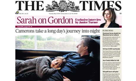
The text on the paper would appeal to a older audience in comparison to the eastenders E20 which appeals to a younger audience. The text about the article also shows the paper is appeling to a older demographic by the poliotical article about Gorden and Cameron . The Times font is the most popular fonts which suggests that its the most popular with literacy, publishing paperback books, its is still used in typography widely. The text is separated with a coat of arm leading it even more weight and status and representing the British culture. When you read further into the paper you are into a much more refined text in comparison to the 'Daily Mail which contains more colours and is more attractive in a visual way. However this paper is much more elegant which has been reflected through the style of font.
Captions :

Photo captions, also known as cutlines, are a few lines of text used to explain or elaborate on published photographs. For example these words in this picture shows Sarcasm to the audience to make them laugh or to portay a certain emotion / feeling.
Captions more than a few sentences long are often referred to as a "copy block". They are a type of display copy. Display copy also includes headlines and contrasts with "body copy", such as newspaper articles and magazines.
Captions for moving image

The captions represents the videos. The captions are used to represent the video's and give it a title name. The headline also reflects the information that has been provided in the video.
Theme music and music beds in Audio-Visual
Theme music and music beds:
Theme music is a motif used to recognise programmes for example theme tunes are used in all soaps (shown below is eastenders theme tune) when people hear this motif this helps people to remember the show by there catchy theme tune. The instrumentation used in the theme music of Eastenders is suggestive of bells. This is a tuitional london sound. St Mary le-Bow is a historic church in cheap side. In the city of London. According to tradition a true cockney has to be born within hearing distance of Bow bells the stock characters, those with most importance in Eastenders speak with the cockney accent adopted by working class Eastenders and therefore the music motif which utilises the bell sound in the theme tune is symbolising both in Eastenders themselves and their more positive characteristic qualities, time nit community, chatty, friendly, salt of the earth etc.
Hollyoakes example
The music bed that has been represented in Hollyoaks has a Rock, Pop track that suggest things are happening which are out of place as the scenery is in a church building. Then when the bride puts the bride down there is a string onsoblne which suggest that every thing is okay with gusset coming, the string instrumental is ironic suggesting a fulse sense of decorum which is ironic indicating that the behaviour isn't oppriote for the wedding or the interter of a marriage building.
Theme Music and Music beds In Print
LS Lowry exhibition opens at Tate Britain - video
(The signature video title intro starts after the adverts from the Guardian, link below)
The music which has been represented on this video of the Guardian has been refined with mosaic graphics with a clean and aesthetic sound which give the video a geometric and sophisticated sound which compliments the graphics. The sound has been synthesised to give a rising tone and a professional tone leading to a clean sound furthermore that goes with the visual elements, then following with a leading lower tone with the Guardian logo appears covering the seriousness of the paper.
Cropping, Text, Sizing, use of stars in print

This paper shows that there is a cropping shot of the queen that has been fitted around the text. The text explains that it is the queens birthday which is unrelated to the headline of ' Now we face a month of rain'. However the text 'Happy and glorious' relates to the Britishness and of the rain / British weather.
The choice of fonts stands out as it is bold and grabs your attention against the white background. The queen stands out as a use of star, as this paper would attract a older demographic audience which would appeal to them. The font size on this paper is bigger than the title of the paper, which grabs the audience attention. The headline about the weather doesn't really create a positive affect but the text underneath the picture of the queen creates are more positivity effect of a celebration.

The cropping of this photograph used for this paper shows Tony Blair with his arms out with people taking photos in the background. The sizing of the image takes up the majority of the paper which stands out. The caption 'The end of New Labour' stands out in bold text which goes with the picture and shows that Tony Blair is happy with the political results. The use of stars are represented with political peple such as Tony Blair which identifies the story of Labour. The choice of font use with the article is small, but in simple text such as Time New Roman which is easy to read and this text could reflect the demographic audience who reads the paper. The use of star in this picture is an image of Tony Blair which reflects a political/ more intellectual demographic by the broadsheet paper, and by the content represented in the paper.

This picture is an example of a use of stars of the imagery of 'David Beckham'. The use of stars encourage readers to buy the paper and buy it, to follow the celebrity lifestyle. Readers may be interested in buying the paper to find out about David Beckham's first daughter. With David Beckham sporting followers, they will be interested to find out about his lifestyle.

This is an example of a broadsheet newspaper given us an example of use of star. Robert Pattinson will attract the readers who follow him as a celebrity to buy/ read the paper. The use of stars attract an a much more broaden audience and attract and increase the readership.

This is an example of a broadsheet newspaper given us an example of use of star. Robert Pattinson will attract the readers who follow him as a celebrity to buy/ read the paper. The use of stars attract an a much more broaden audience and attract and increase the readership.
No comments:
Post a Comment